

Paula Villarreal - The Brief
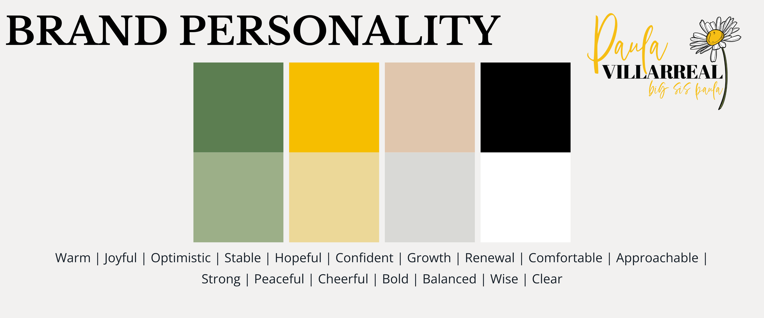
Paula Villarreal’s brand identity was designed to reflect her joyful and encouraging presence as a mentor. It needed to be happy, optimistic, and confident. Every detail captures her joy and her desire to uplift others with prayer, encouragement, and guidance.
Brand Design & Identity
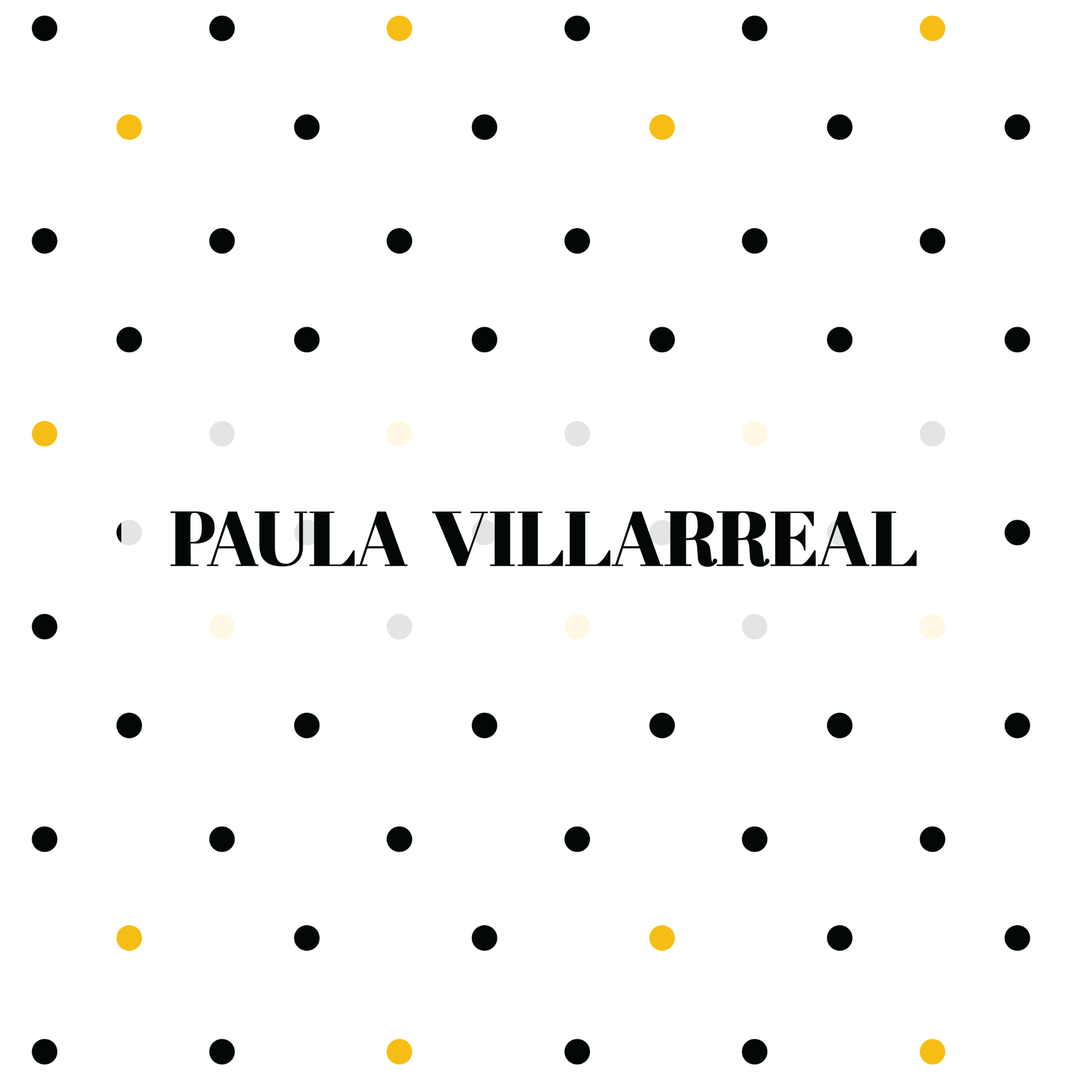
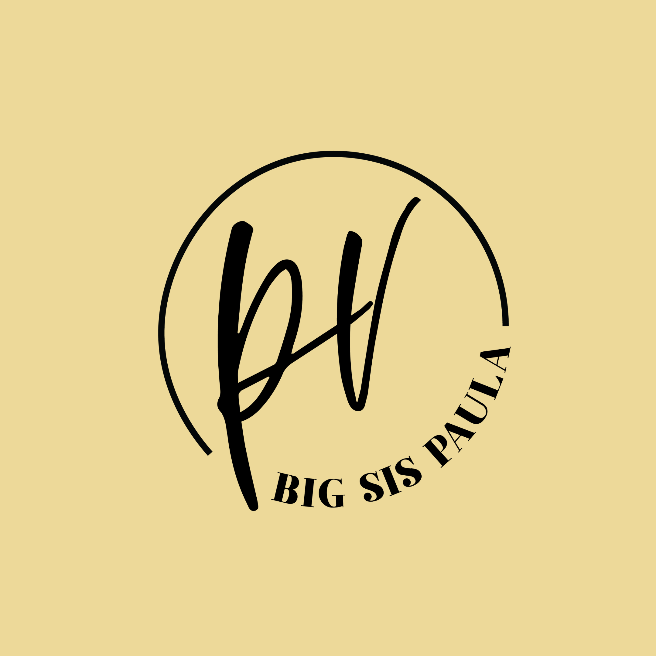
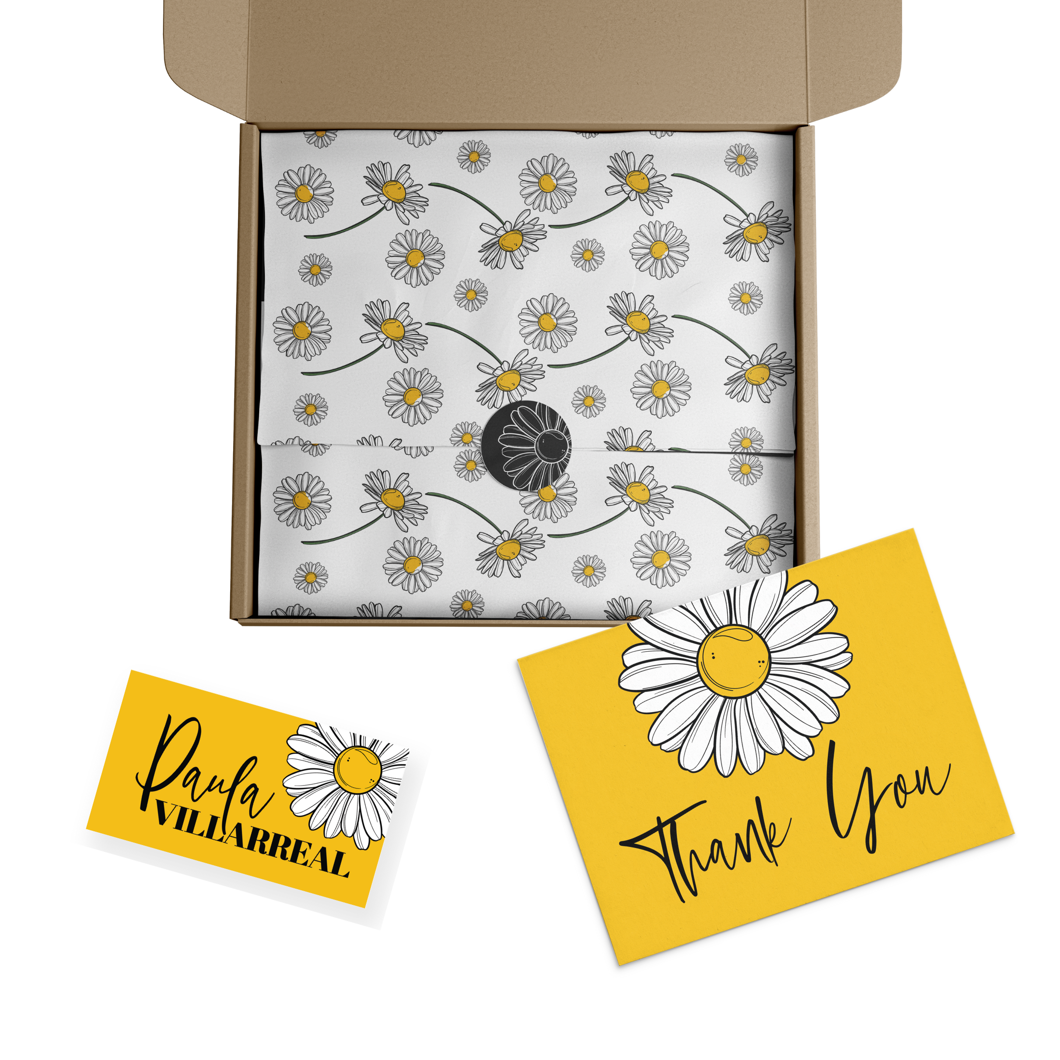
Paula Villarreals's brand has elements of fun that connect her joyful spirit and faith background. Using these elements, I created custom patterns for her that are playful and reflect the optimism her brand instills. We went with a three font typography strategy. The main type is bold in statement, the accented font is a soft and subtle script, and the body font is a sans font.
The Elements
A Strong Foundation
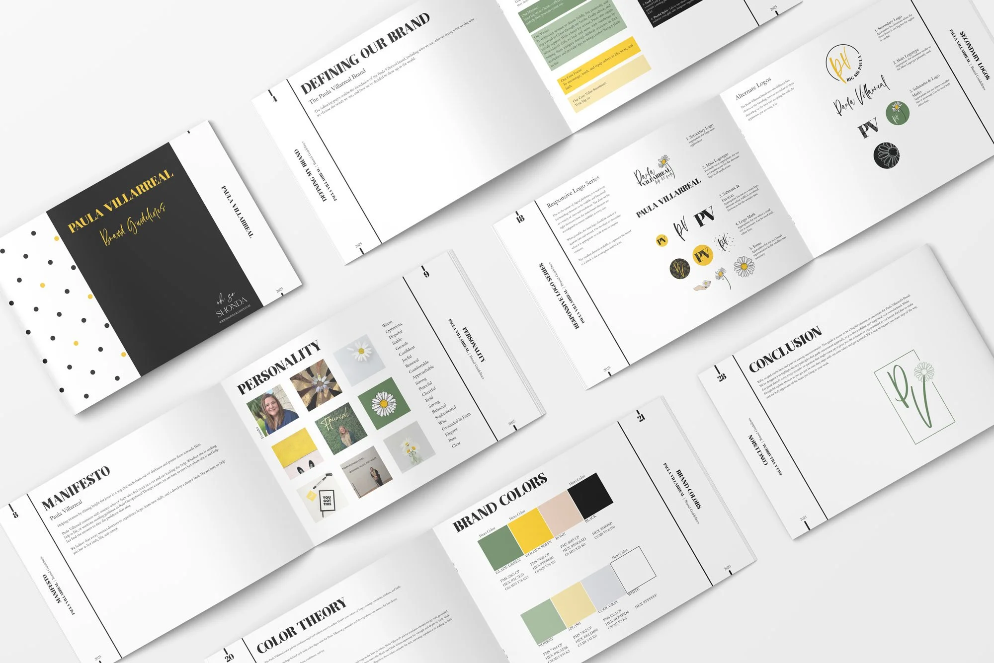
Establishing core values, a mission, and a vision has provided Paula with a strong foundation to launch her new brand. She did the hard work of defining these by utilizing my brand coaching and workbook process.
If this portfolio catches your eye and you’d like to work with me on a project, you can get started with a free introductory call.