

Michelle Bolanger - The Brief
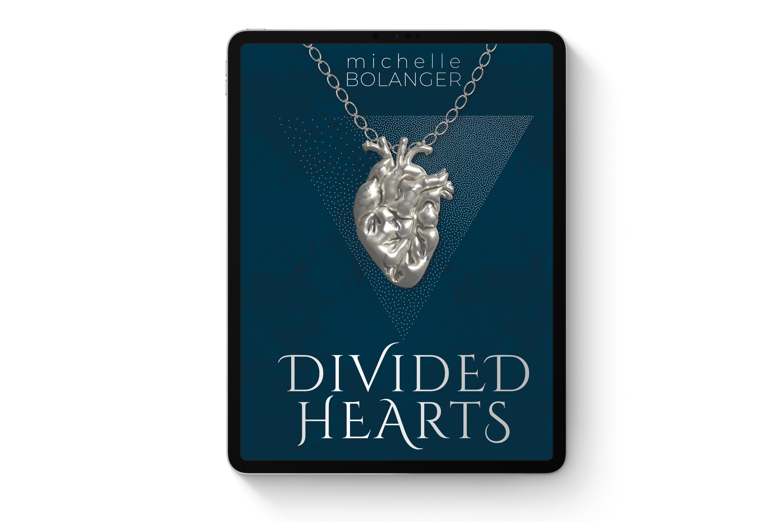
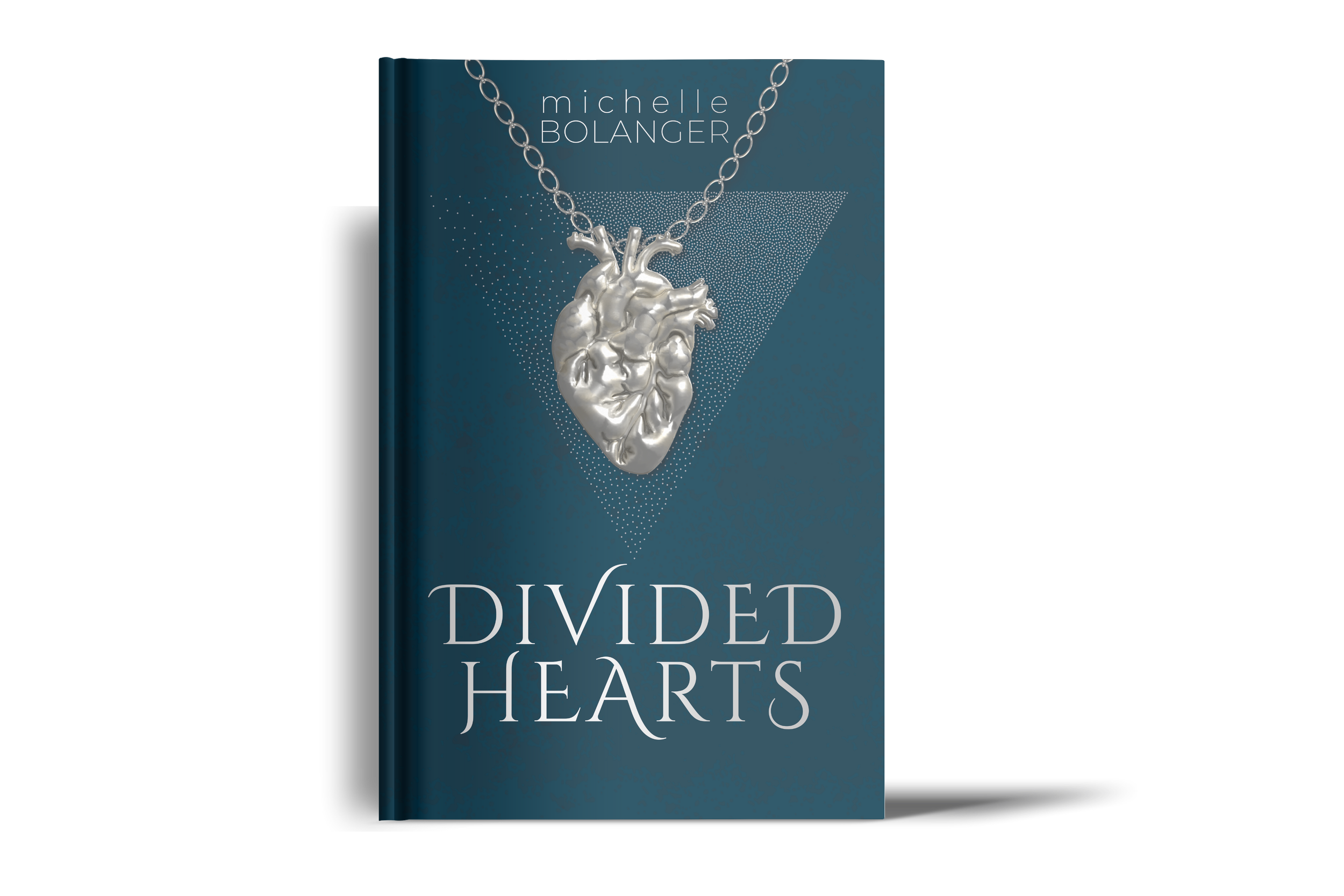
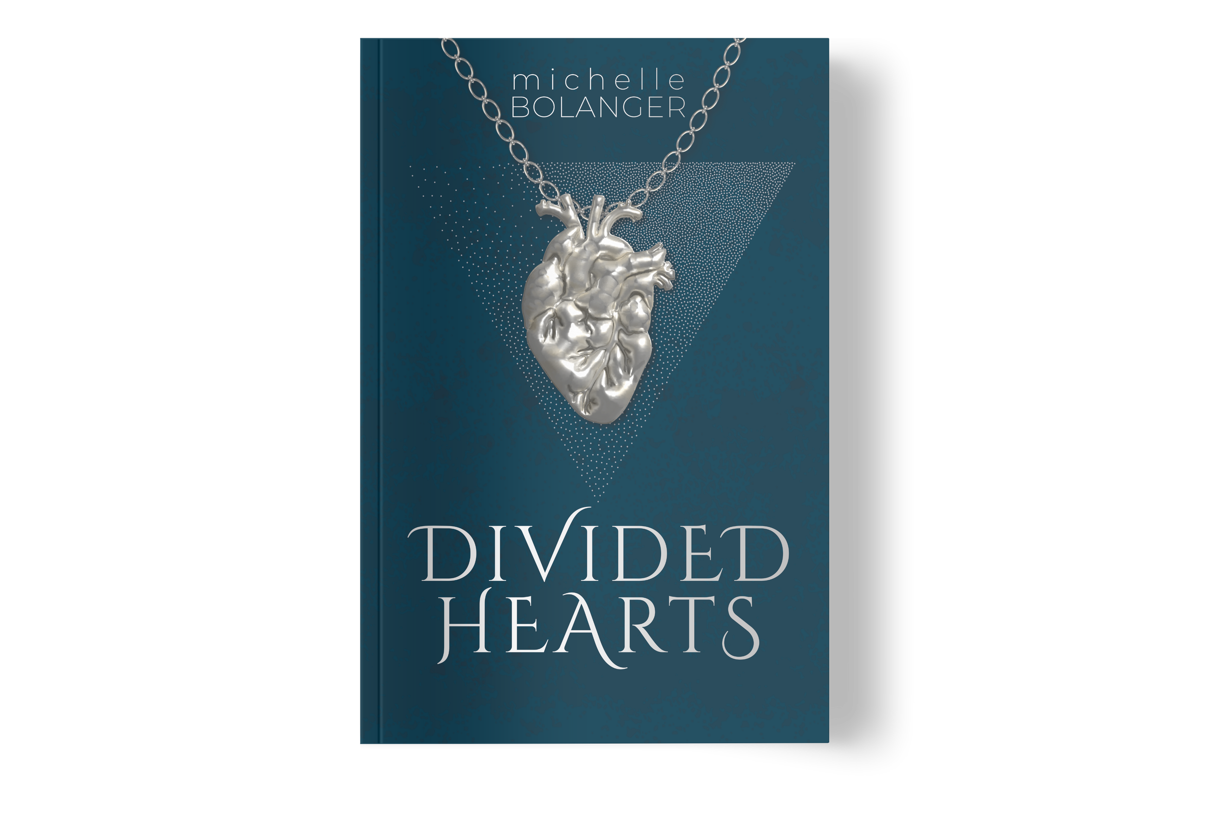
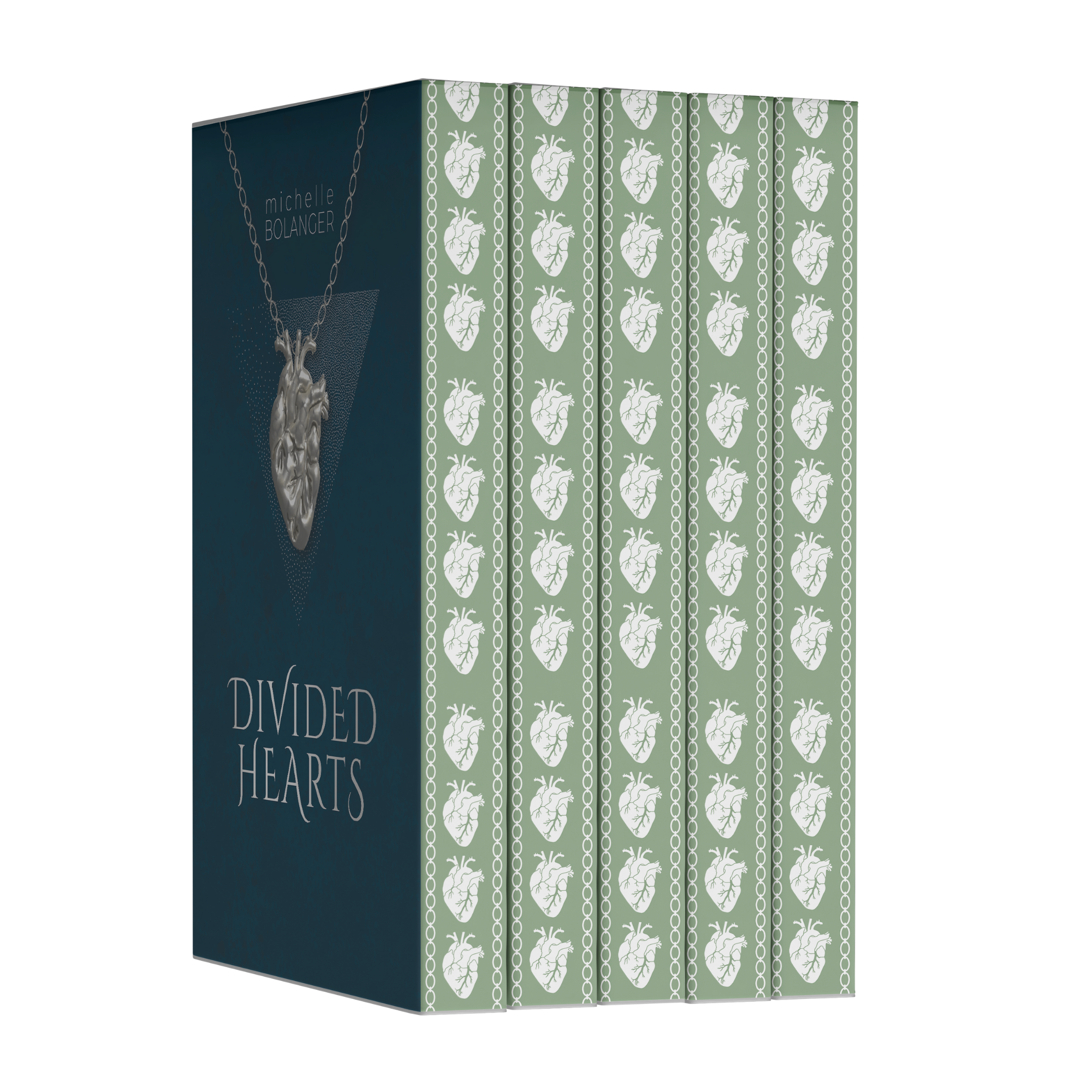
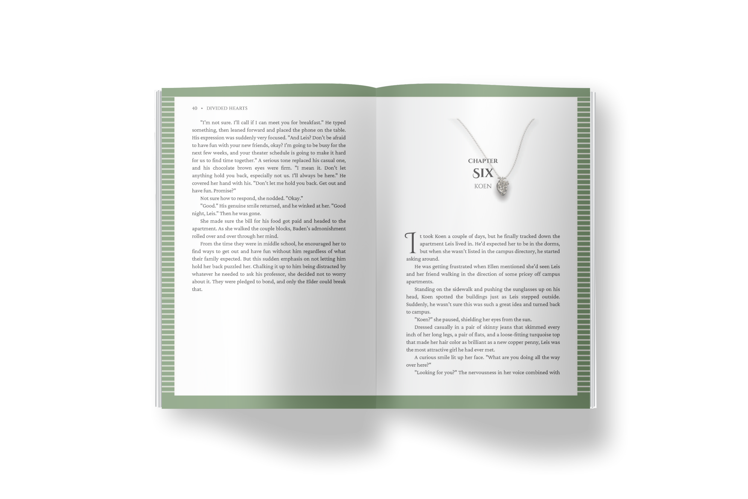
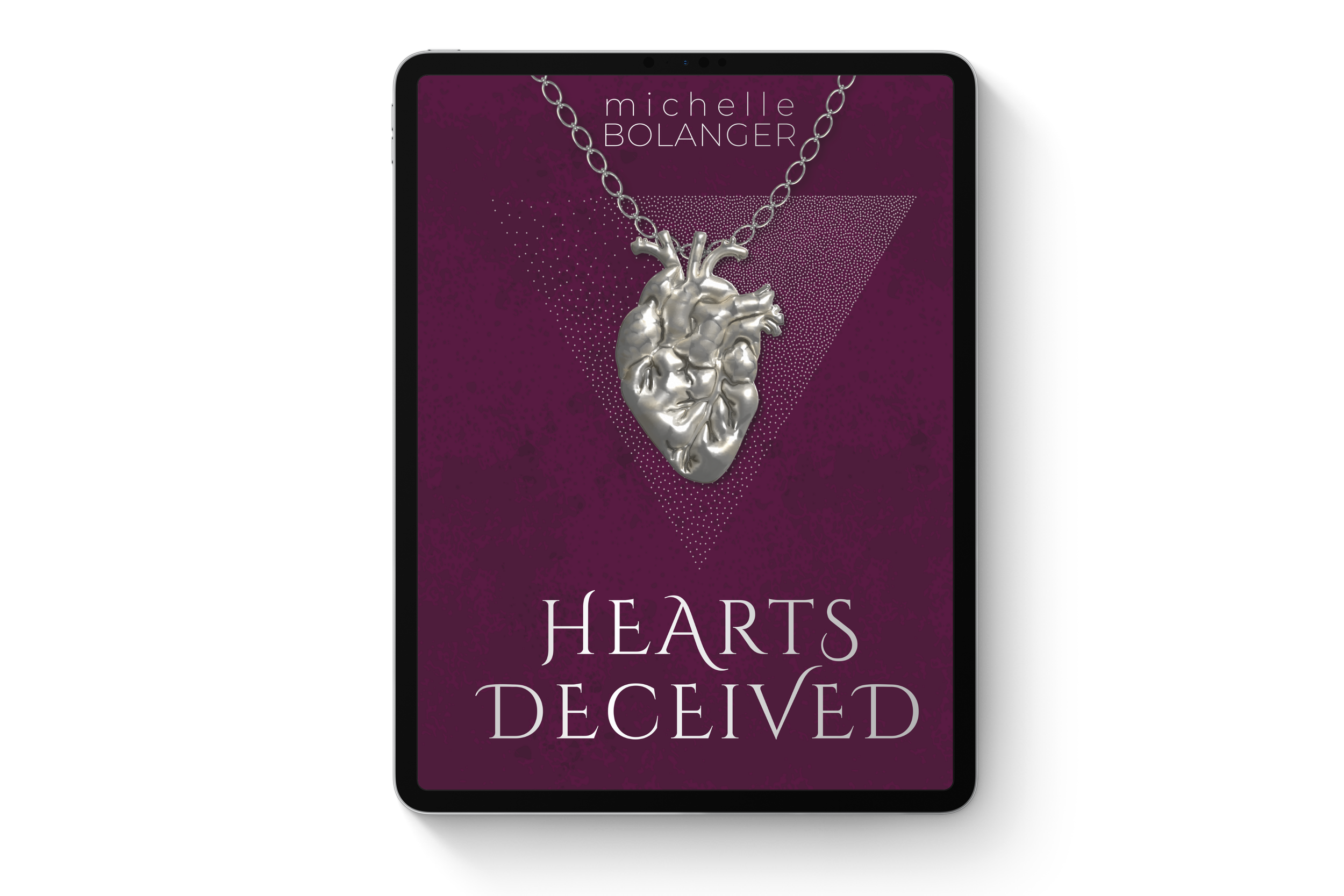
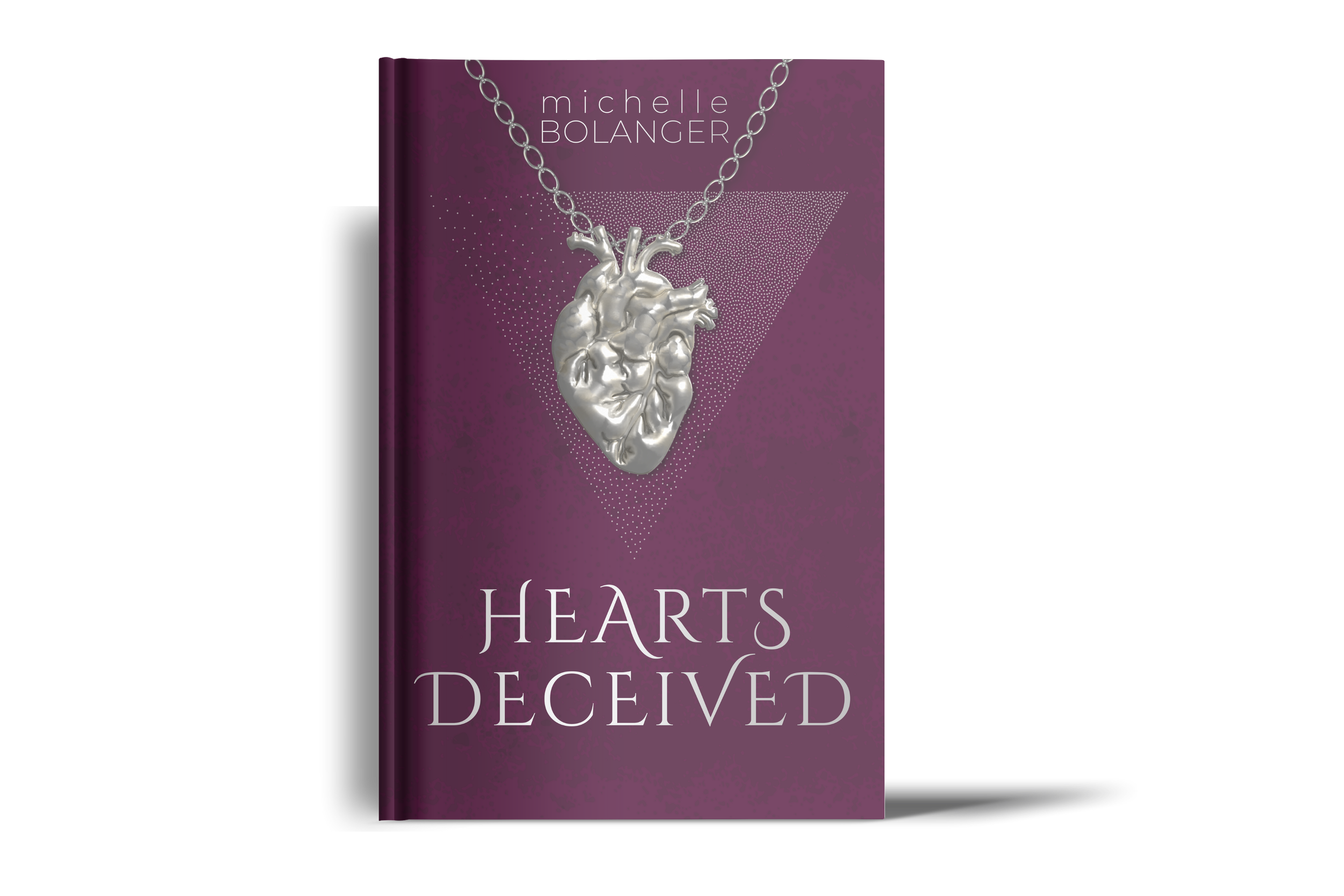
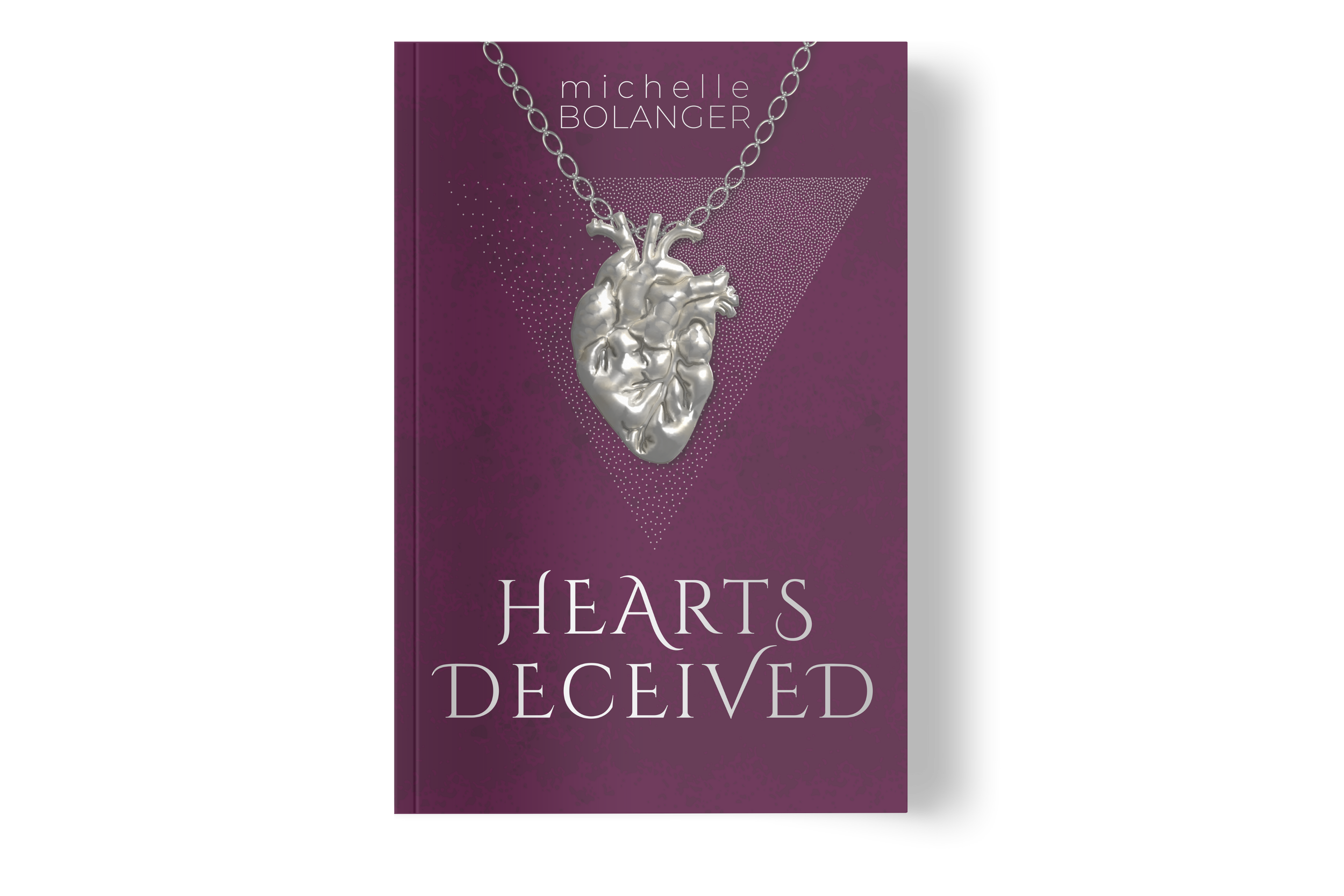
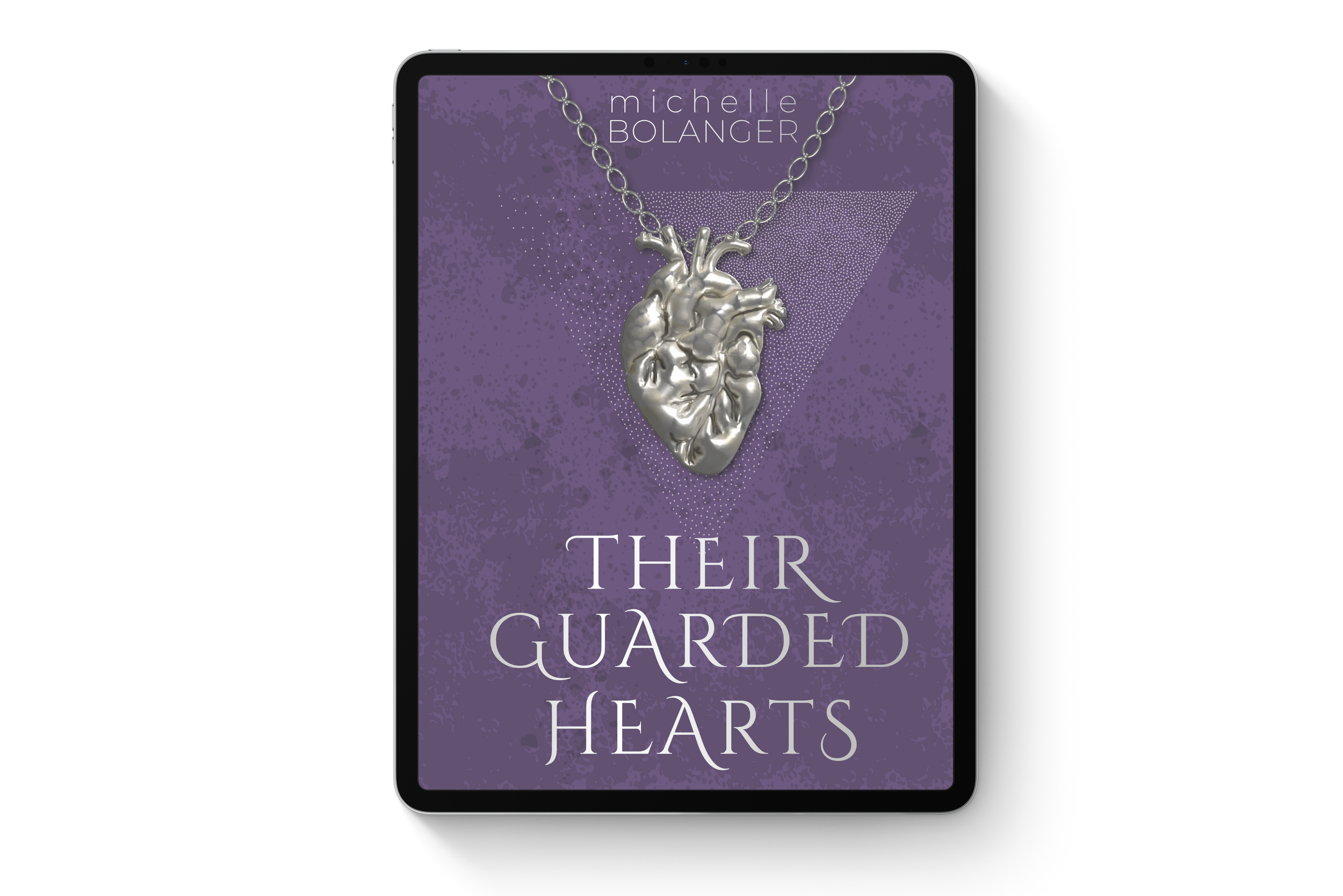
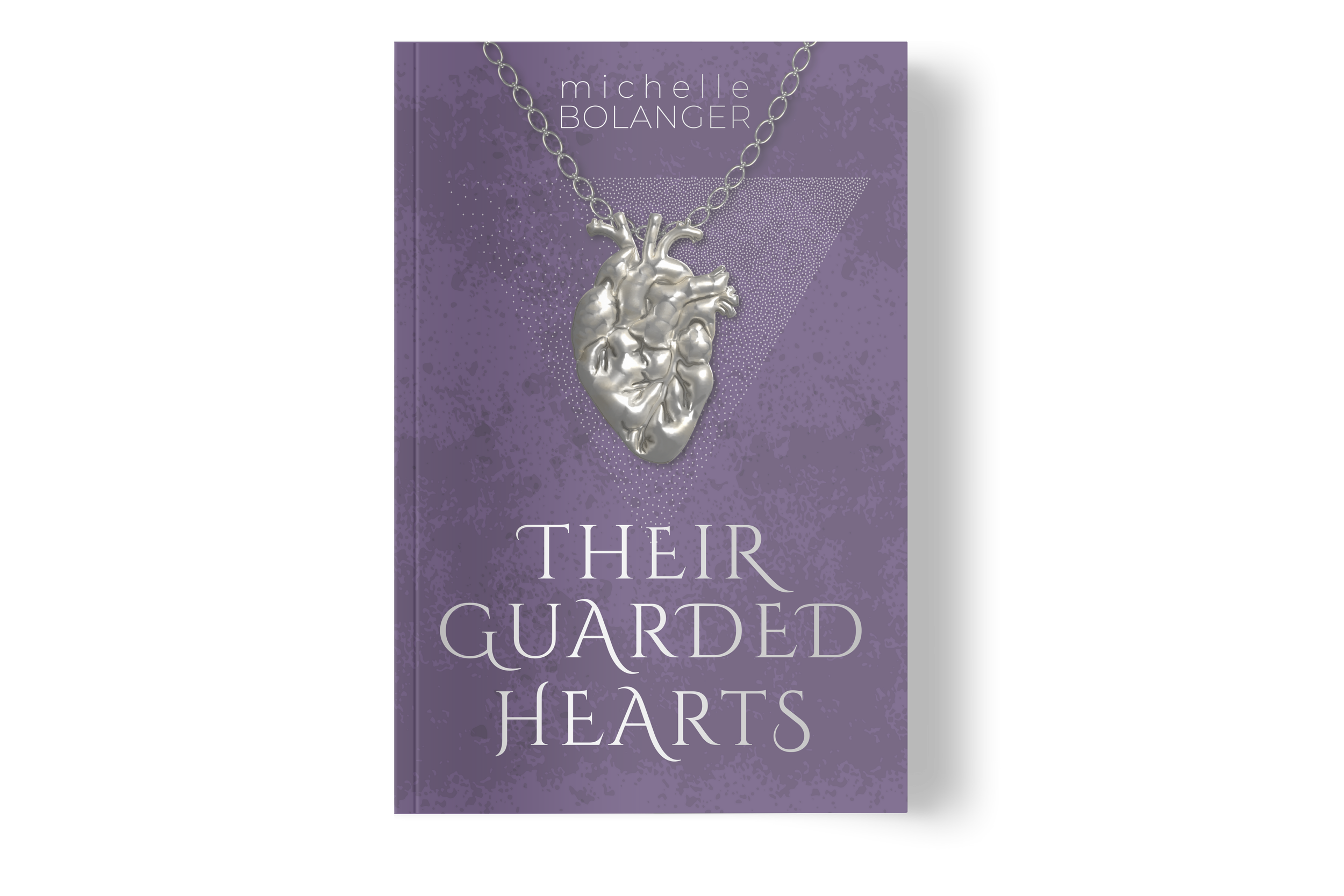
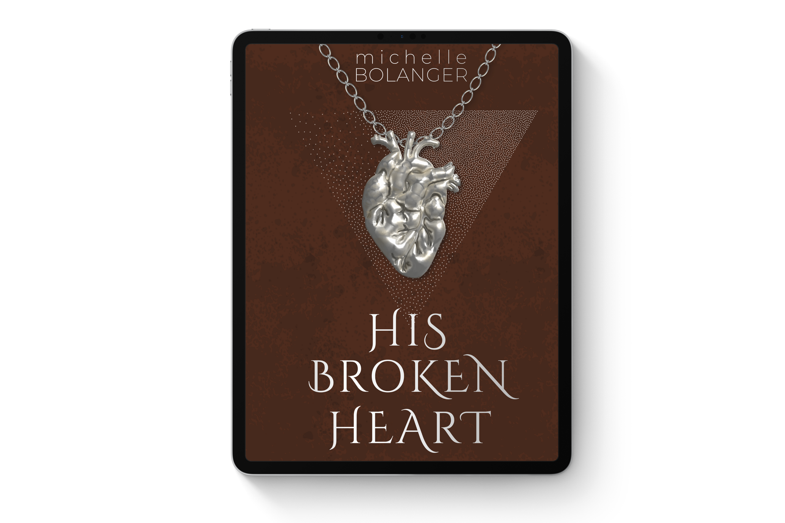
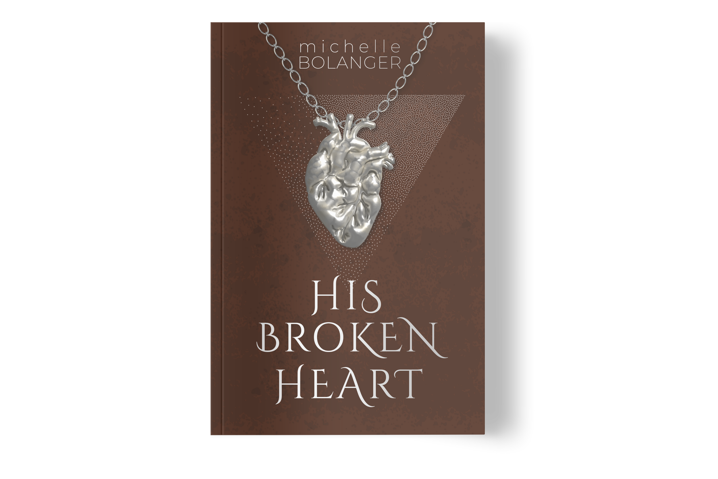
In collaboration with Michelle Bolanger, we worked together to establish a brand identity with creativity and hope. This style complemented her teachings and aligned with her message of faith, while also staying true to her personality. Michelle also collaborated with me on her books, where I contributed by designing covers, forced edges, and formatting the interiors to reflect her stories.
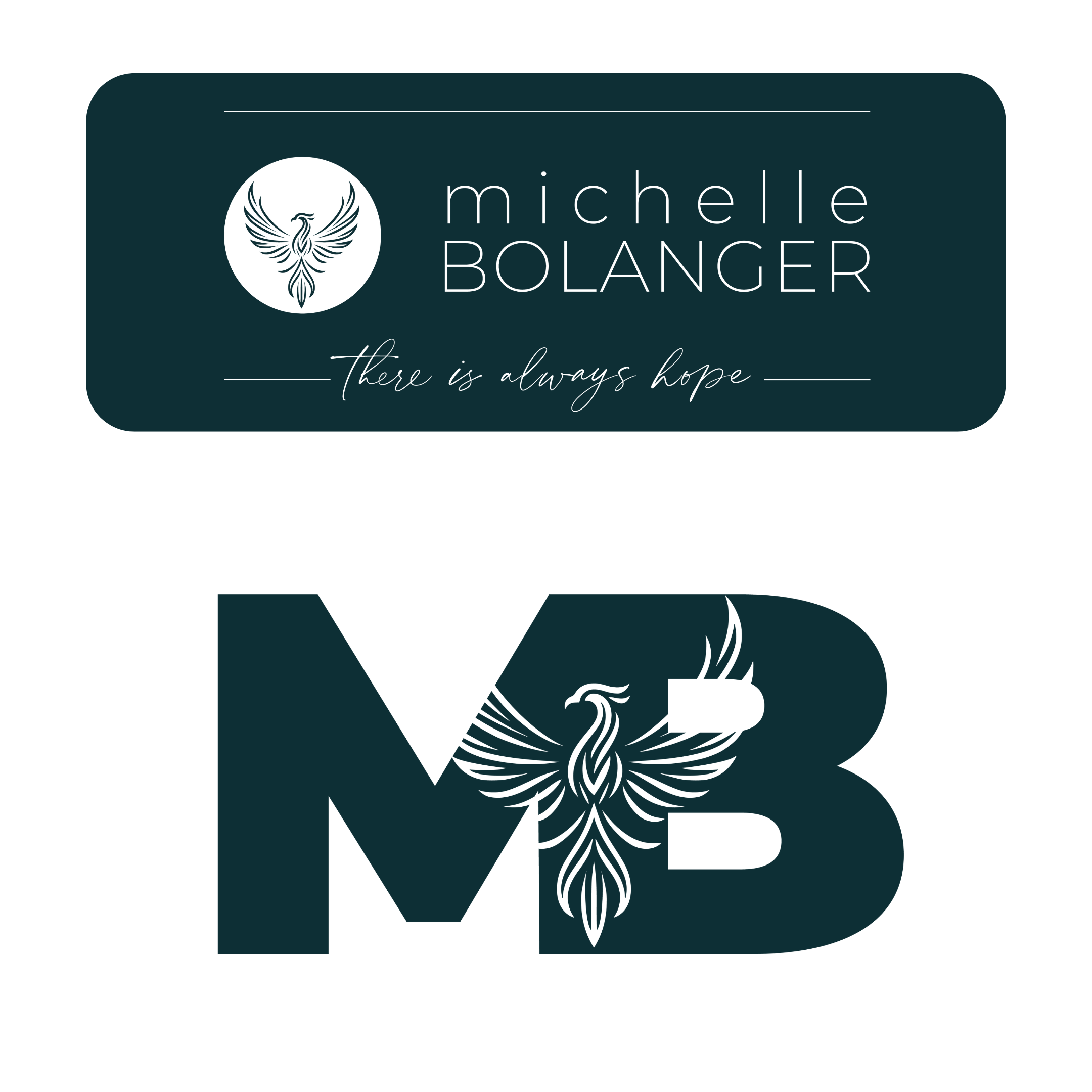
Brand Identity & Logo Design

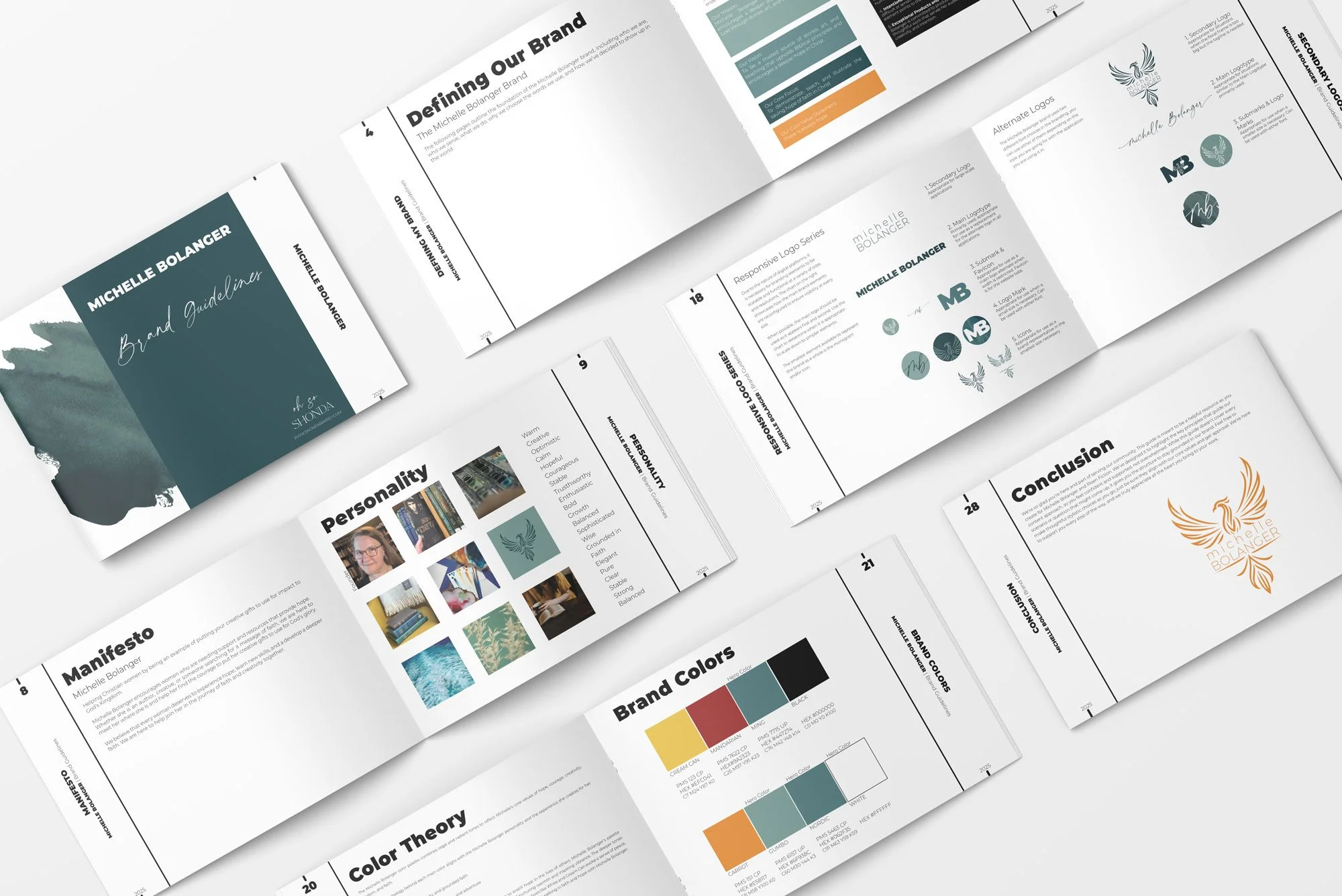
Michelle's brand combines elements from various artists. She designed the watercolor elements, and I recolored them to match her final brand color palette. I created the monogram by incorporating her initials with the phoenix. We went with a two font typography strategy. The main type is bold in statement, the accented font is a elegant script, and the body font is similar to the main type but at a different weight.
The Elements
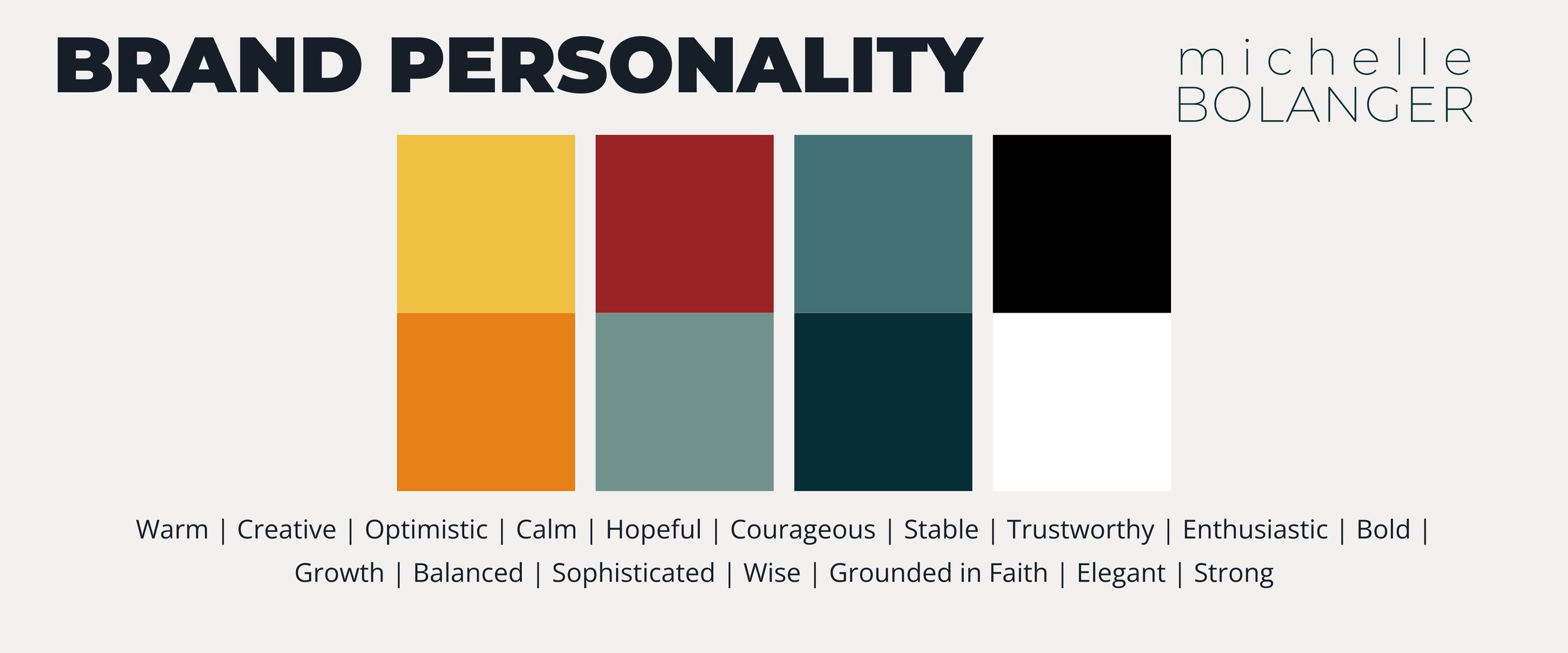
Rising Above
Michelle put in extra hard work to get to the heart of her brand with the help of my workbooks used in brand coaching. By spending time in prayer and reflection, she was able to break down barriers that stood in her way as she rose above her trials. The end result speaks for itself.
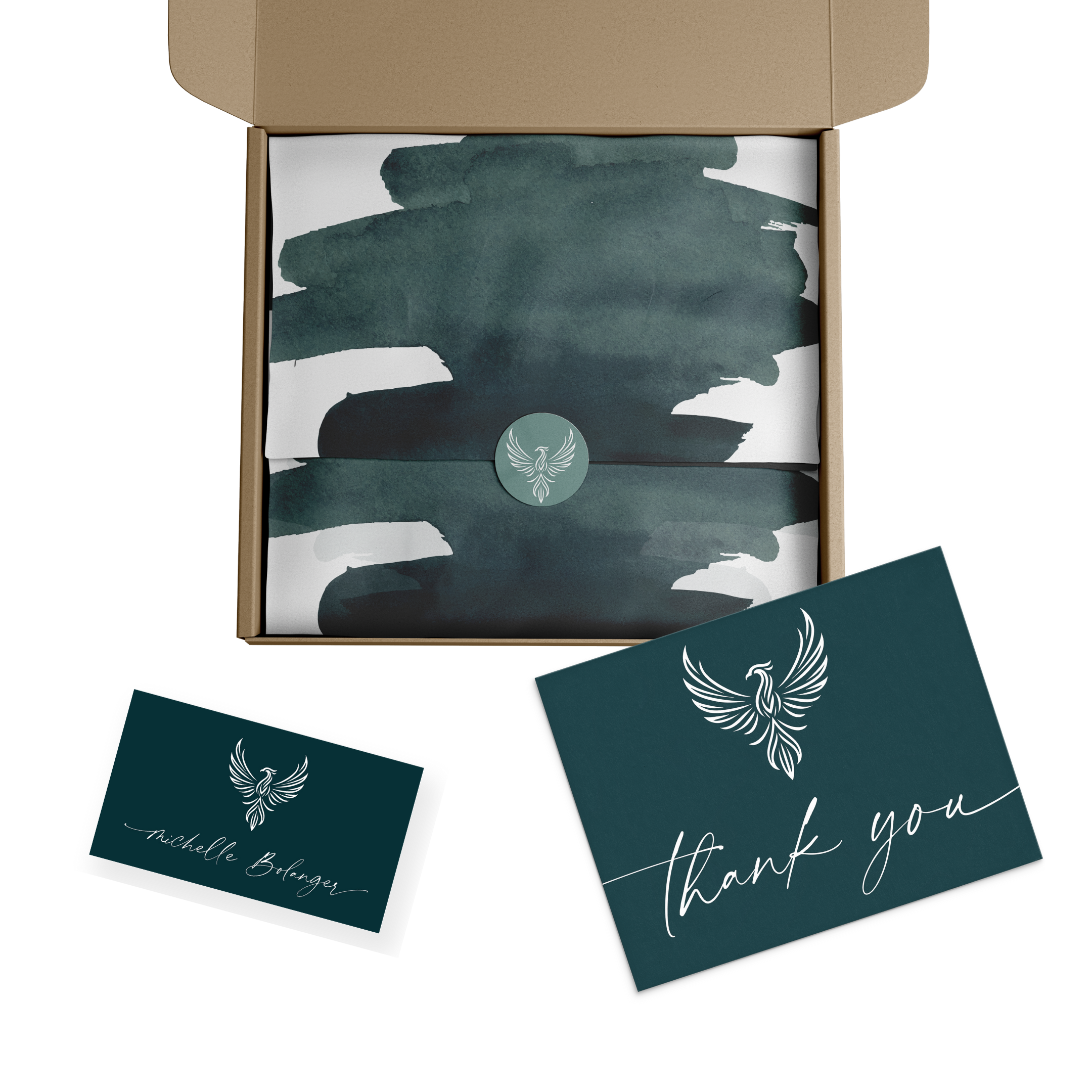
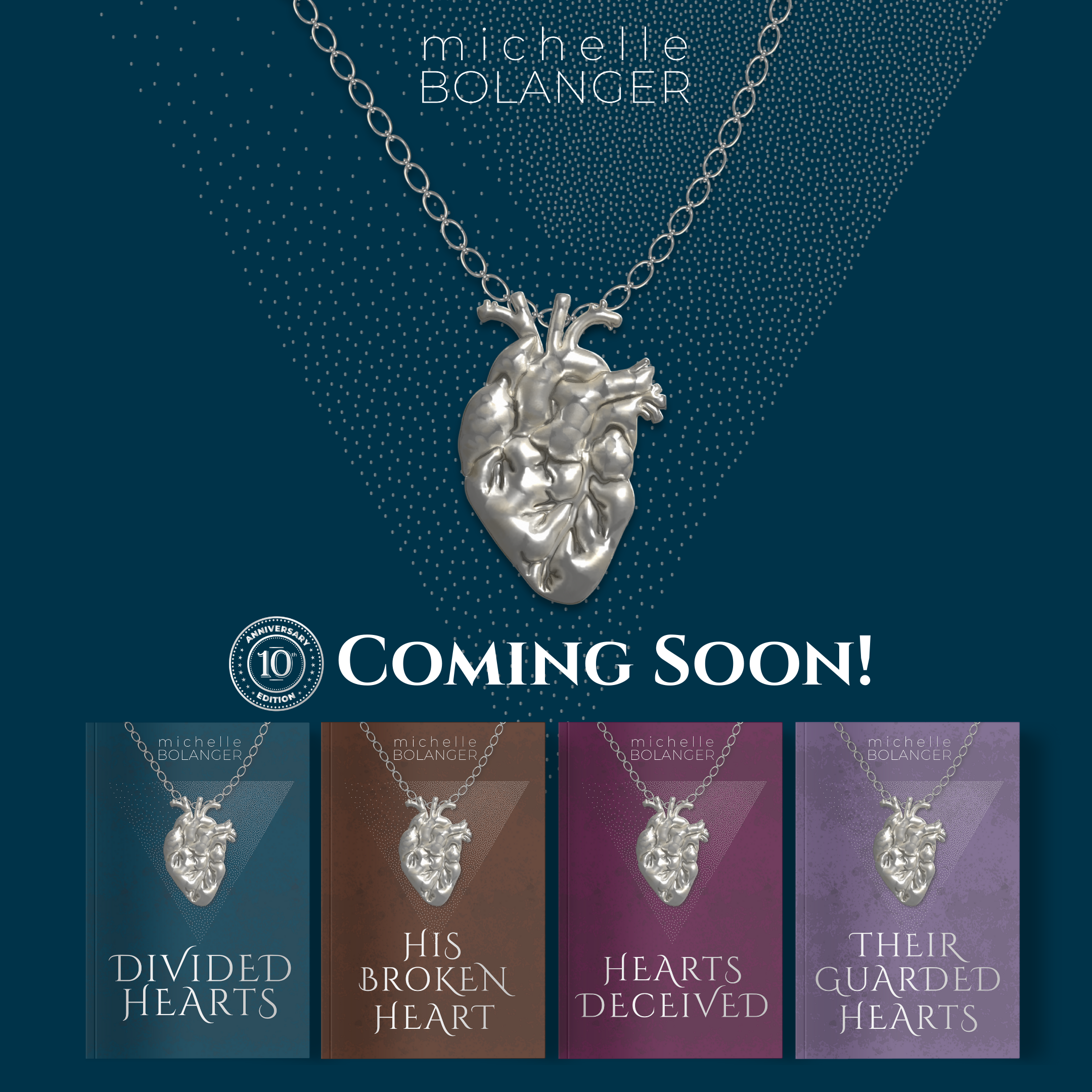
Book Covers & Formatted Interiors

“I know I’ve only just started working with you and getting to know you, but your wisdom and coaching have already impacted my life in ways I never would have expected.” —Michelle Bolanger, Author
Client Review
If this portfolio catches your eye and you’d like to work with me on a project, you can get started with a free introductory call.