Designing a brand and a journal with impact for someone who is grieving the loss of their loved one comes with the determination to ensure the end result is perfect. We wanted to keep it elegant but add warmth to it to capture Tina's personality.
Brand Identity
The Elements
Tina’s brand was designed to extend a gentle invitation. One rooted in grace, comfort, and quiet strength. Using warm neutral tones and soft pampas grass elements, the visual identity welcomes you to sit down for a heartfelt conversation over coffee. It offers a space where widows and widowers feel seen, heard, and held as they walk through their grief.
Pulling it all together
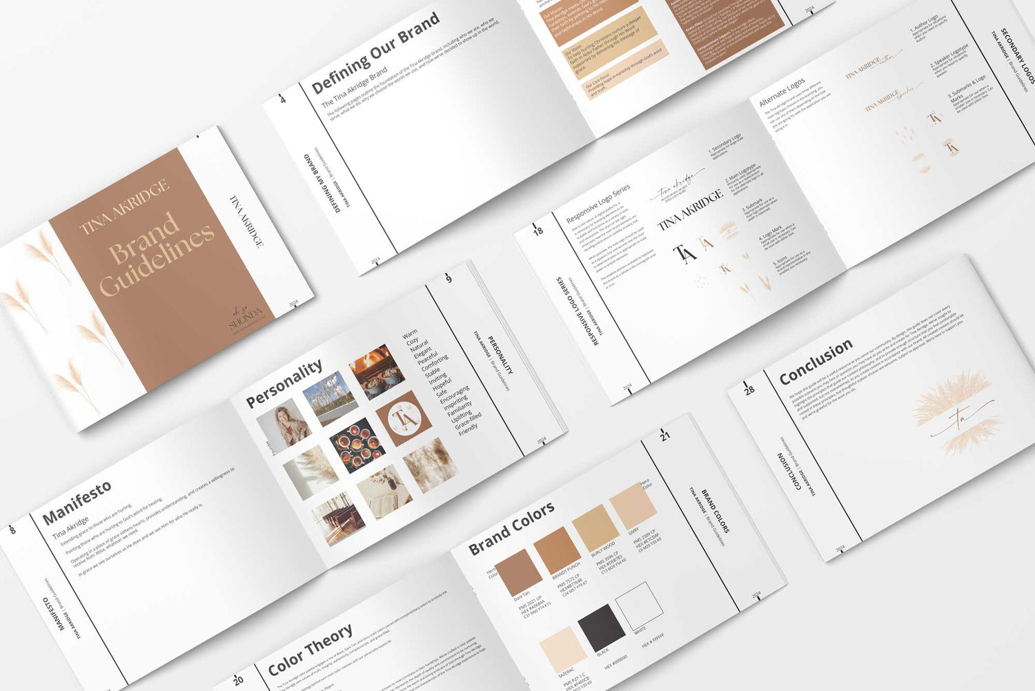
This brand was a challenging one to pull together in a seamless way that didn't feel over the top. In the end, I believe we got there, and can feel the love and warmth throughout her brand.
Book Design & Interior Formatting
Learn more about Tina Akridge
If you'd like to learn more about Tina Akridge and what she offers, visit her website to see all the great things she does.
Subscribe to my emails
Grab a cup of coffee and sit down with me each week. It's free coaching!
Choosing a selection results in a full page refresh.