Liz Anne’s brand identity was designed to reflect her inspiring and encouraging presence as an author. It needed to be bright, supportive, and purpose driven. Every detail captures her faith and her desire to uplift others with compassion, optimism, and strength.
Brand Design & Identity
The Elements
Liz Anne's brand has elements of fun that connect her book theme of puzzle pieces with things that represent her, like florals, hearts, and butterflies. Using these elements, I created custom patterns for her that are playful and reflect the family values her brand instills. We went with a three font typography strategy. The main type is bold in statement, the accented font is a soft and subtle script, and the body font is a sans font.
A Strong Foundation
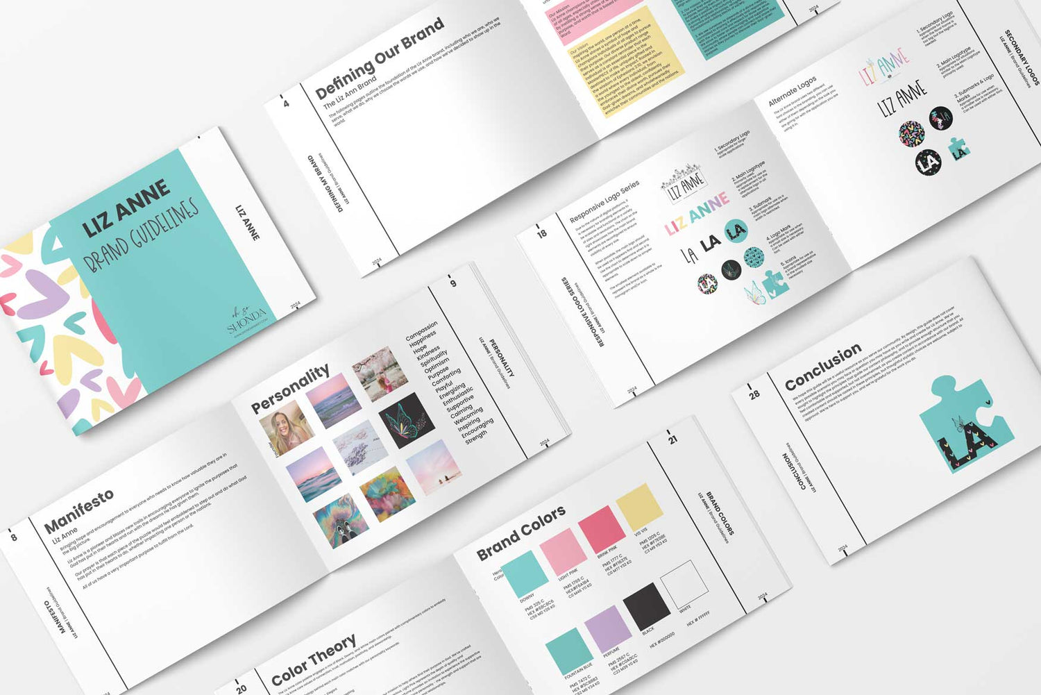
Incorporating Liz's first book and the overarching theme of being God's masterpiece helps bridge the gap between both brands for a cohesive combination.
Subscribe to my emails
Grab a cup of coffee and sit down with me each week. It's free coaching!
Choosing a selection results in a full page refresh.